Shopify CRO: 10 Best Practices That Move Revenue, Not Just Clicks
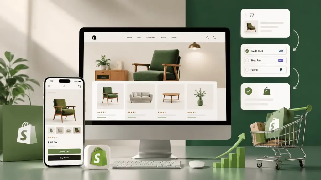
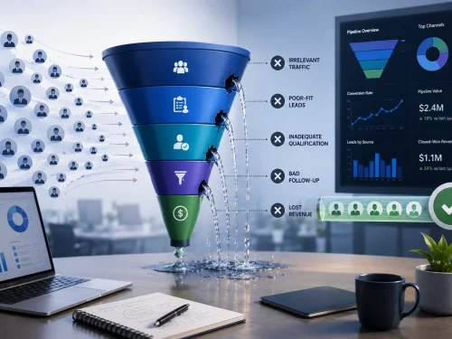
Getting traffic to your Shopify store doesn’t guarantee sales. Shopify reports that the average Shopify store converts at around 1.4%, while the top 10% reach 4.7% or higher. That gap is rarely one big fix. It’s usually two or three specific leaks compounding across the funnel, and closing them is what separates an average store from a top-decile one.
The problem is often not traffic, but friction. Shoppers can’t find the right product, hesitate because information isn’t building enough confidence to purchase or is missing entirely, abandon their cart when costs become clear, or face a complex, drawn-out checkout.
Take a hypothetical apparel and footwear store we’ll call Northline. Northline gets solid traffic from paid social and organic search, but converts at just under 1.5%, roughly the category average. We’ll come back to Northline through this piece to show what each fix looks like in practice, not just what it should accomplish in theory.
Here are the 10 best CRO practices for your Shopify eCommerce business to remove those barriers.
How to Improve Shopify CRO: 10 Best Practices
1. Start With the Pages Where Shopify Shoppers Actually Make Decisions
Before changing your theme, identify where conversion is being lost. Look at the relationship between:
- Collection-page views and product clicks
- Product-page views and add-to-cart events
- Cart sessions and checkout starts
- Checkout starts and completed purchases
- Mobile and desktop conversion rates
- Product recommendation impressions, clicks, cart additions, and purchases
You’ll find most of this inside Shopify Admin under Analytics → Reports, which includes session, checkout-progress, device, product recommendation, search, and web-performance data. If your team already runs GA4 alongside Shopify, that works too, the important part is looking at funnel-stage relationships, not just an overall conversion rate.
This matters because the right CRO fix depends on the leak.
- If shoppers browse collections but rarely open products, improve product discovery and merchandising.
- If product views are high but add-to-cart rates are weak, investigate product information, price presentation, variants, media, and buying confidence.
- If carts are created but checkout completion is poor, look at shipping costs, payment options, checkout friction, and cart abandonment.
Don’t optimize the entire Shopify store at once. Find the largest commercially meaningful drop-off first. For Northline, that turned out to be the collection-to-product-click stage, which is where we’ll pick the example back up.
2. Optimize Shopify Collection Pages for Product Discovery
A collection page has a different job from a product page. Its purpose is to help shoppers quickly answer: “Which product should I look at?”
That means collection pages shouldn’t simply display a grid of products. They should help shoppers narrow their choices. Northline’s sneaker collection listed 140 products with only a price filter. Shoppers were bouncing to the search bar instead of browsing, and search wasn’t returning size or fit options either, which meant a large share of visitors never made it to a product page at all.
Make product cards decision-ready
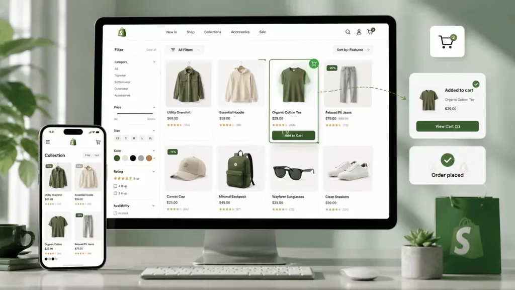
A product card should provide enough information to make the next click feel worthwhile. Depending on the category, that may include:
- Product name
- Price and sale price
- Variant or size availability
- Ratings or review count
- Key product attribute
- Product badges such as “Best Seller” or “New”
- Color or variant swatches
- Quick-add functionality where appropriate
Avoid filling cards with promotional labels that compete for attention. The objective isn’t to make every product look urgent; it’s to make relevant products easier to evaluate.
Improve collection filtering
Shopify shoppers should be able to narrow a large catalog using attributes that actually affect their purchase decision. For apparel and footwear, that could mean size, color, fit, and material. For skincare, skin type, concern, formulation, and ingredient preferences may matter more. For furniture, dimensions, material, style, and availability can be stronger filters.
The important point is that filters should reflect how customers shop the category, rather than simply exposing every product attribute stored in Shopify. Northline’s fix was adding size and fit filters, both attributes shoppers were already searching for by name in the search bar. Shopify’s native filter blocks handle this for most catalogs; stores with more complex filtering needs, large multi-attribute catalogs or faceted search across thousands of SKUs, typically add a dedicated filtering and search app rather than building it from scratch.
Use merchandising intentionally
Don’t assume the highest-selling products should automatically occupy the first positions. The first products shoppers see should support the commercial objective of the collection. You might prioritize best sellers for broad categories, high-margin products for strategically important collections, or products that represent the category particularly well.
Shopify’s Search & Discovery ecosystem also supports product recommendations and merchandising controls, giving merchants more control over how products are discovered.
3. Make Shopify Product Pages Answer Purchase Questions
Product pages are where browsing becomes buying intent. The biggest mistake that hurts your conversion rate is treating them as image galleries with an “Add to cart” button underneath.
Optimize product pages to answer the questions that prevent customers from purchasing.
Put critical product information near the buying decision
Above the fold, shoppers should quickly understand:
- What the product is
- Who it is for
- What makes it different
- Price
- Available variants
- Primary product benefit
- Delivery or shipping expectation
- The next action to take
Don’t force shoppers to hunt through tabs for information that affects the purchase decision. For Northline, fit was the top source of hesitation, its product pages buried sizing guidance inside a separate tab. Moving a short “runs true to size” note next to the variant selector was a low-effort change directly tied to its highest-friction question.
If compatibility matters for your category, explain compatibility before the add-to-cart decision. If shipping time determines whether someone buys, make the delivery expectation visible rather than burying it in a policy page.
Build purchase confidence with reviews and proof
Product information answers what the product is. Reviews and proof answer whether it’s worth trusting. This isn’t optional for most categories, it’s table stakes.
- Show review count and average rating near the product title, not buried at the bottom of the page.
- Surface fit-specific or use-specific feedback where relevant, “runs small,” “great for wide feet,” rather than only generic star ratings.
- Use customer photos or user-generated content where you have it. Shoppers trust other customers’ images more than studio photography alone.
- Keep trust signals, secure checkout badges, return policy, shipping guarantees, visible but not overwhelming. One clear line usually does more than five competing badges.
Use product media to reduce uncertainty
Shopify supports images, video, 3D models, and external video as product media. Use those formats when they answer a question that static photography cannot. For example:
- Clothing: show the product worn and demonstrate fit.
- Beauty: demonstrate application and texture.
- Furniture: show scale and dimensions in context.
- Electronics: demonstrate controls or physical details.
- Complex products: use video to explain setup or functionality.
The objective isn’t to add more media. It’s to give shoppers enough visual information to make a confident decision.
Treat variants as part of CRO
Variant selection is a frequent source of friction on Shopify product pages. Make selected states obvious. Don’t make unavailable combinations look selectable. Where possible, connect variant selection to the relevant image, price, and availability information.
If shoppers repeatedly select a variant only to discover that it’s unavailable, the experience is creating unnecessary friction and potentially distorting conversion data.
Make the primary purchase action persistent on mobile
On mobile, shoppers may scroll through reviews, specifications, and media before deciding to buy. If the purchase action disappears completely, they have to scroll back to find it.
A carefully designed sticky add-to-cart area can reduce that friction, but it should remain subordinate to the product information and shouldn’t obscure content. Shopify’s own theme performance guidance emphasizes that mobile conditions deserve particular attention, since mobile devices face greater CPU, memory, and network constraints.
4. Treat Mobile Performance as a Conversion Issue
Increasing mobile conversions isn’t simply about making buttons larger. It’s about ensuring that the buying experience remains usable when the customer has a slower connection, smaller screen, and less processing power.
Shopify’s web performance reporting evaluates loading speed, interactivity, and visual stability, while its theme guidance specifically recommends testing under realistic mobile CPU and network conditions.
Prioritize the elements customers need immediately. For example, Shopify recommends not lazy-loading the LCP image and instead prioritizing the image that appears in the initial viewport. It also recommends rendering essential content in Liquid and HTML rather than unnecessarily waiting for JavaScript.
One of the best CRO practices for Shopify eCommerce businesses is simple: don’t make shoppers wait for the information they need to decide.
Audit heavy apps, unnecessary scripts, oversized media, animations, pop-ups, and third-party widgets, particularly on collection and product templates where performance directly affects shopping behavior.
Also compare mobile conversion with desktop performance at each stage of the funnel rather than looking only at overall conversion rate.
5. Use Upsells to Increase Average Order Value Without Interrupting the Purchase
Upselling should help customers complete the purchase they’re already considering.
Shopify supports related and complementary product recommendations. Related recommendations suggest alternatives, while complementary recommendations can support “Pair it with” or add-on merchandising. Shopify also allows merchants to configure complementary recommendations through Search & Discovery.
The distinction matters. If someone is buying a camera, recommending another camera immediately after they’ve selected one may create decision friction. Recommending a compatible memory card or case is more naturally connected to the purchase.
Good placement for upsells typically falls into three categories:
- Complementary products: Items that make the primary product more useful.
- Quantity or bundle offers: Incentives to purchase more when the economics make sense.
- Relevant upgrades: A higher-value version that solves a meaningful need.
Keep the recommendation relevant to the current cart. The more products you introduce without a clear reason, the more likely the upsell becomes a distraction rather than conversion support.
Shopify also provides recommendation conversion data that shows whether recommendations generate clicks, cart additions, and purchases. Use that data to remove recommendations that attract attention but fail to contribute to the funnel.
The goal of upsells isn’t simply to increase average order value. It should increase order value without reducing the likelihood that the original purchase is completed.
6. Make the Cart a Decision Checkpoint, Not a Dead End
The cart is often treated as a simple summary page. That’s a missed CRO opportunity.
Before sending shoppers into checkout, the cart should confirm that the order is correct and eliminate avoidable uncertainty. Show:
- Products and selected variants
- Quantities
- Prices
- Discounts
- Estimated shipping information where available
- Order subtotal
- Relevant threshold information
- A clear checkout action
If free shipping applies above a specific threshold, show the shopper how close they are to reaching it. If an add-on is genuinely useful, present it here, but don’t turn the cart into a product catalog.
Make cart editing easy
Customers should be able to change quantity, remove products, and review variants without restarting their shopping journey.
A cart drawer can also work well for stores where shoppers frequently add multiple products, because it keeps them in the shopping experience. However, test whether a cart drawer actually improves progression. A faster-looking interface isn’t automatically a higher-converting one.
Put accelerated checkout where it can reduce friction
Shopify supports accelerated checkout buttons on product and cart pages, including options such as Shop Pay and other enabled wallets. These options are particularly useful when a customer already knows what they want and doesn’t need additional persuasion.
The important CRO consideration is hierarchy. Keep the standard purchase path obvious while giving returning or wallet-ready shoppers a faster route.
7. Reduce Shopify Checkout Friction Instead of Over-Customizing It
Once shoppers reach checkout, the CRO objective changes. You’re no longer trying to sell the product. You’re trying to complete the transaction without introducing new reasons to hesitate. This can be achieved by improving the checkout flow.
Shopify supports different checkout layouts, including one-page checkout and accelerated checkout experiences. In one-page checkout, information, shipping, and payment are presented together; Shop Pay can pre-fill customer information for eligible shoppers.
Use that flexibility carefully. A good checkout flow should make the following obvious:
- What the customer is buying
- What they are paying
- Where the order is going
- Available shipping options
- Available payment methods
- Any discount that has been applied
- What happens after payment
Avoid adding unnecessary messages, banners, surveys, cross-sells, or fields simply because Shopify allows customization.
Account for international and currency friction
If you sell across the US, UK, and Australia, checkout friction often shows up as currency confusion rather than a broken flow. Common fixes:
- Display local currency automatically based on the shopper’s location, with an easy way to switch if it’s wrong.
- Show tax-inclusive pricing where local regulations expect it, rather than surprising shoppers with tax added at checkout.
- Make duties and import fees clear before checkout for cross-border orders, not as a surprise on delivery.
For Shopify Plus merchants, checkout UI extensions can add functionality to checkout’s information, shipping, and payment steps. That capability should be used to remove friction or provide useful information, not to turn checkout into another marketing page.
Performance matters here too. Shopify notes that checkout extensions add JavaScript and network work to checkout, and unused extensions can still create performance costs. Audit checkout apps and extensions just as seriously as storefront apps.
8. Address Cart Abandonment by Finding the Reason, Then Recovering It
Cart abandonment isn’t one problem. A shopper may abandon because:
- Shipping is more expensive than expected.
- Delivery takes too long.
- Their preferred payment method is unavailable.
- They are comparing alternatives.
- The product information didn’t resolve a concern.
- They are not ready to buy.
- The checkout experience is inconvenient.
- They encountered an error.
A blanket discount doesn’t solve all of these problems. Instead, segment cart abandonment by stage and behavior.
- If shoppers abandon after seeing shipping costs, investigate shipping communication earlier in the journey.
- If they reach checkout but don’t complete payment, investigate payment options, errors, and checkout friction.
- If they add products to cart but rarely start checkout, investigate cart design, pricing clarity, and purchase confidence.
The goal is to fix the underlying reason for abandonment before trying to recover the session. Once you’ve identified the reason, recovery email and SMS flows should reflect it rather than sending the same generic reminder to everyone.
- A shorter first reminder, sent within an hour or two, works well for shoppers who were simply interrupted rather than hesitant.
- A follow-up addressing a specific objection, shipping cost, sizing, delivery time, performs better than a generic “you left something behind” message if you know what stalled them.
- Save incentive-based messages, discounts or free shipping, for later in the sequence rather than the first touch, so you’re not training shoppers to abandon carts expecting a discount.
- SMS tends to work best for time-sensitive nudges close to checkout; email carries more of the reassurance and objection-handling work.
This is where CRO and retention marketing meet, the fix isn’t only on the storefront, it’s in what happens after someone leaves without buying.
9. Build CRO Around Shopify Data, Not Assumptions
A Shopify CRO program should operate as a continuous feedback loop:
Identify → Diagnose → Change → Measure → Iterate
Start with a measurable problem. For example: mobile product-page add-to-cart rate is significantly lower than desktop.
Then investigate the likely causes: performance, variant interaction, product media, sticky CTA behavior, information hierarchy, or mobile-specific friction.
- Make one meaningful change, establish the measurement period, and compare the relevant funnel metric.
- Do the same for collection-to-product clicks, cart-to-checkout progression, checkout completion, and recommendation performance.
This is more valuable than making ten theme changes simultaneously and then claiming that the conversion rate improved because “the site feels better.”
10. Prioritize the Shopify CRO Work That Affects Revenue
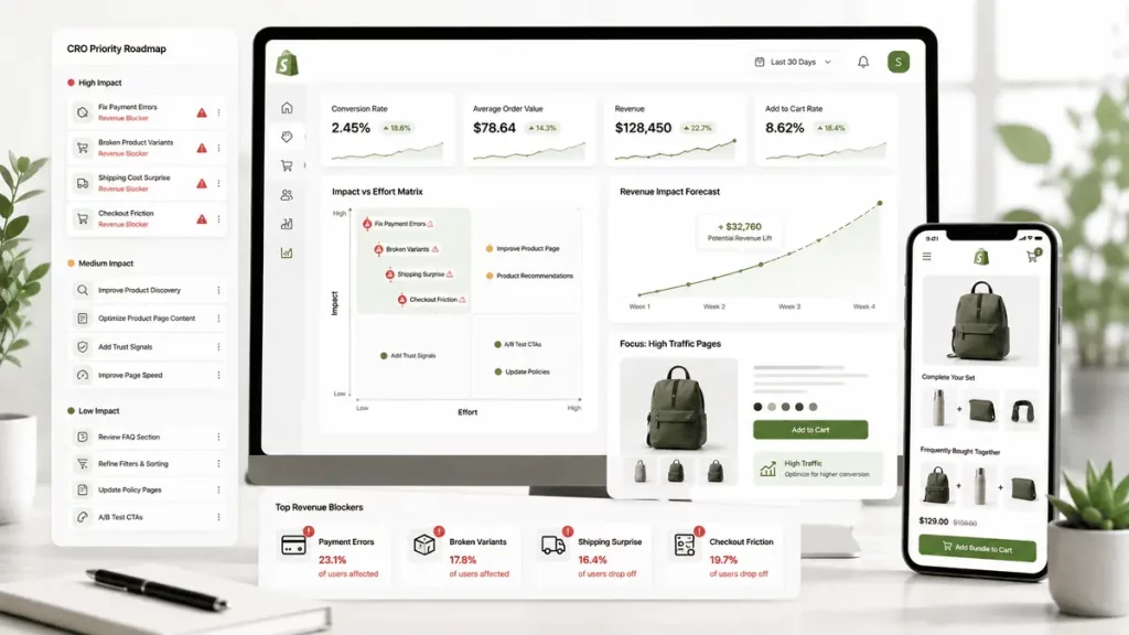
Not every CRO improvement deserves equal attention. A practical Shopify prioritization framework is:
- Fix transaction blockers first. Payment errors, broken variants, unavailable products, shipping surprises, and checkout problems can directly prevent purchases.
- Fix high-traffic funnel leaks. A small improvement on a product template used by 80% of your traffic can matter more than a major improvement on a low-traffic page.
- Improve purchase confidence. Strengthen product information, media, reviews, variant selection, and delivery clarity.
- Improve mobile execution. Test the actual mobile experience, including performance and interaction, not simply the responsive desktop layout.
- Increase average order value after the core purchase path works. Use relevant recommendations, bundles, and complementary products without compromising conversion.
- Remove unnecessary complexity. Every app, popup, script, extension, recommendation, and checkout customization should justify its impact.
Most of these practices work with native Shopify features, product cards, filters, cart drawers, checkout layouts. A few, deep faceted search, advanced checkout UI extensions, typically require Shopify Plus or a dedicated app. Know which category each fix falls into before you commit engineering time to it.
Conclusion
The gap between a 1.4% store and a 4.7% store isn’t one redesign. It’s fixing the two or three leaks costing the most revenue first, then working down the list. For Northline, that meant collection filtering and product-page sizing information before anything else, not a full theme overhaul.
Treat CRO the same way: diagnose where your funnel is actually leaking, fix the highest-impact stage, measure it, and move to the next one.
Frequently Asked Questions
What’s a good Shopify conversion rate?
The average Shopify store converts around 1.4%, while top-performing stores reach 4.7% or higher. Your own benchmark depends on category, price point, and traffic source, a low-price impulse category typically converts higher than considered, high-ticket purchases.
Do I need Shopify Plus to do CRO properly?
No. Most of the fixes in this guide, collection filtering, product-page structure, cart design, review placement, work on any Shopify plan. Shopify Plus mainly matters for advanced checkout customization through UI extensions, which most stores don’t need until checkout itself is the specific bottleneck.
How long does Shopify CRO take to show results?
It depends on your traffic volume, since you need enough sessions to trust the data. Higher-traffic pages, like collection or homepage changes, can show a readable signal within a couple of weeks. Lower-traffic stages need longer measurement windows before you can act on the result with confidence.
Should abandoned cart recovery be email, SMS, or both?
Both, used for different jobs. SMS works best for quick, time-sensitive nudges close to the moment of abandonment. Email carries more of the reassurance and objection-handling work, especially for a second or third follow-up that needs to address a specific reason someone didn’t complete checkout.